Ha Ha Factory
Art Direction, Brand Identity, Visual Storytelling
Ha Ha Factory
USA
2020

Insight
Ha Ha Factory was built with one mission: to make humor feel designed, not disposable. Instead of cheap memes, the brand crafts a retro-grunge world of sarcastic wit and moody charm, where humor and darkness coexist. Rooted in millennial nostalgia and pop-culture irony, the brand targets those who find laughter in chaos — the anti-social club of self-aware adults who wear sarcasm as armor.
Idea
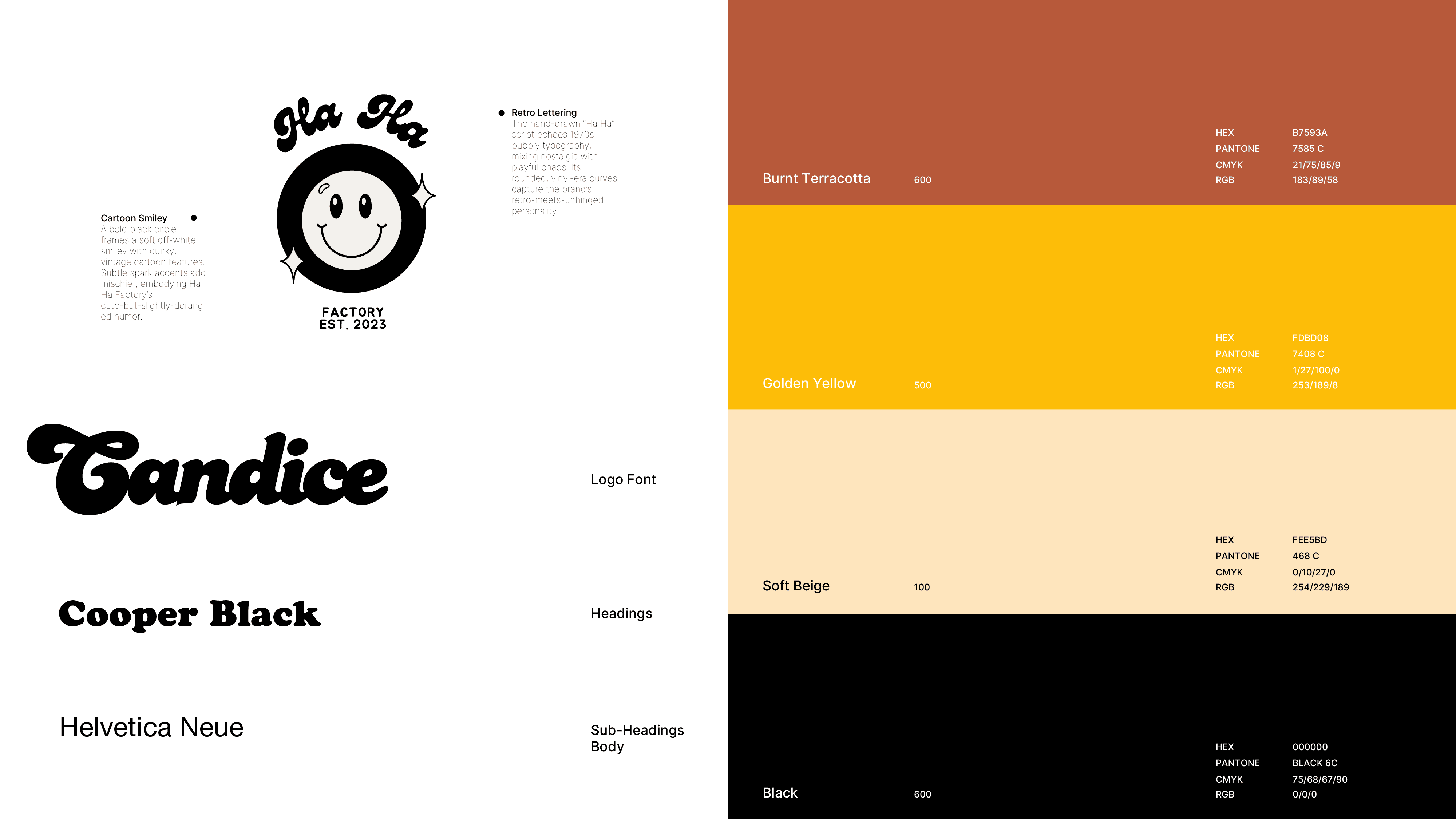
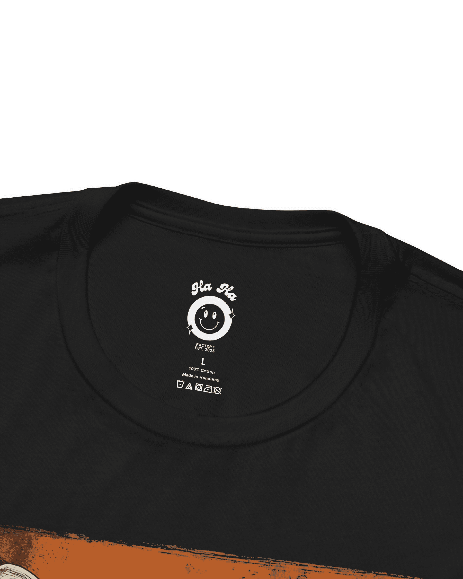
The brand identity fused 1970s smiley-face optimism with a modern, slightly unhinged twist. A circular black-and-white logo — anchored by the warped smile and the tag line “A little unhinged, a lot funny” — set the tone for the entire system. The color palette blended bold yellow and ink black with supporting retro hues like muted blue, vintage red, teal green, and warm creams, echoing aged print textures and sun-faded posters. Through hand-drawn illustrations, collage elements, and nostalgic typefaces, the visual language stretched across T-shirts, packaging, and social media. Each product became its own mini-poster of ironic expression — balancing humor, darkness, and intentional design craft.

Impact
The result was a distinctive visual ecosystem that blurred the line between fashion and satire. While the brand used paid campaigns, the concept and visual identity did the heavy lifting — driving strong social engagement and building a genuine connection with a millennial audience drawn to witty, self-deprecating humor and nostalgic aesthetics. Beyond sales, Ha Ha Factory became a creative outlet for character-driven storytelling — a proof of concept that design-led irony can be both collectible and cultural.